Quantile plot
This post describes a simple quantile plot with count data. I was working on a dataset with count data and wanted to make a quick plot to check the trend of a continuous variable measured multiple times for each count value. A typing error resulted in extra zeros in the number of quantiles being calculated. It took some time to render the full plot, but the animation looked nice!
All code is done with base R, without the need of any additional package. It is aimed to a beginner level to programming with R, so I hope it is accessible to anyone with a very basic level of R.
Advertisement
Preparing the variables
Instead of relying on some real data from somewhere, I’m creating some random data to plot. In the following steps I will create the x and y variables needed to plot.
The x variable simulates a count data. For each count value, there are some measurements taken. You can think as any sequential discrete data, so, it could be for instance, the day you measured some variable (with several measurements in the same day).
counts <- 1:25
n <- 250
x <- rep(counts, each=n)
This creates the x data for our plot. There are 25 different count values and for each value there are 250 measurements, hence the rep function with the each argument.
The y variable is the variable being measured at each count. I need to provide 250 values for each count data. To have some variation to build a nice plot, I’m using a normal distribution to generate random values.
y <- rep(NA, length(x))
for (i in counts) {
    mean.val <- log(i)+1
    sdev.val <- runif(1, 0.2, 0.8)
    y[x==i] <- rnorm(n, mean.val, sdev.val)
}
This code creates a y variable with the same length as the x created above. For each count value a random set of values is created based on a normal distribution with mean increasing logarithmically with the count value and with a random standard variation between 0.2 and 0.8. This gives a sense of increasing average with the increasing count value.
plot(x,y)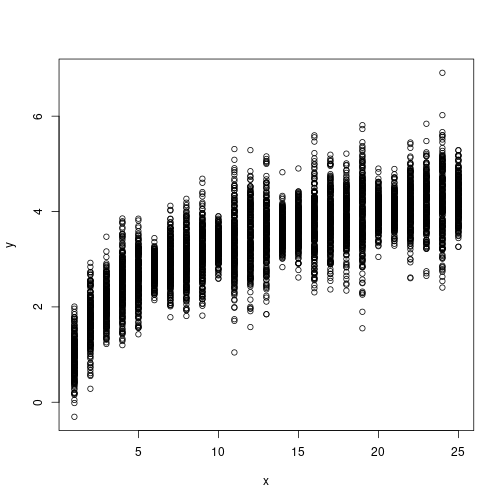
The plot is not extraordinary… we need to summarize somehow the data within each count value. One simple way to implement it is with boxplots of y against x:
boxplot(y ~ x)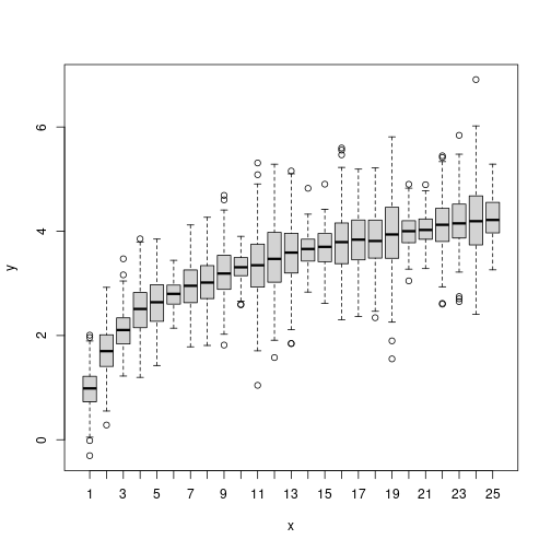
Better, but we need color!
Calculating the quantiles
Here the idea is to use multiple quantiles as a way to summarize the distribution at each count value. For that we need a vector q of probabilities defining the quantiles to be extracted. In this example I’m calculating the probabilities from 0 to 1 with a very small step of 0.0005 (note: the original error that I referred above was here: I mistyped the step and ended with a lot more quantiles calculated).
q <- seq(0, 1, 0.0005)
mat <- matrix(NA, length(q), length(counts))
for (i in 1:length(counts)) {
    val <- counts[i]
    mat[,i] <- quantile(y[x==val], probs=q)
}
In those case where I can easily guess the final size of the results, I create beforehand a matrix with the needed size and then fill it within the loop. The matrix mat has as many rows as quantiles calculated (length(q)) and as many columns as the number of count values available (length(counts)). Since we are looping over count values, each column is being filled sequentially with the quantiles in the loop. By other words, each column has the quantiles calculated for each unique count value.
Advertisement
Plotting
Now we have all the data we need to create the final plot. The idea of the plot is to create a polygon for each probability area. So, for instance, the polygon for probability 95% goes from the lower quantile 0.025 to the top quantile 0.975 (95% of the distribution is within those values). This is done successively from the higher probability to the median (50% probability), which, theoretically, is just a line. Since we use both ends in the polygon, the number of polygons to plot is just the half of the length of the probabilities vector. This is also the number of colors we need and we creating a vector with hcl.colors function with the default viridis palette.
mx <- as.integer(length(q)/2)
colors <- hcl.colors(mx)
The conversion to integers rounds down to the nearest integer in cases of odd numbers of probabilities, as in this example.
Before setting up the plot, let’s first look at how we should provide data for the polygon function in R. It accepts one vector of x and another of y defining the nodes of the polygon to draw.
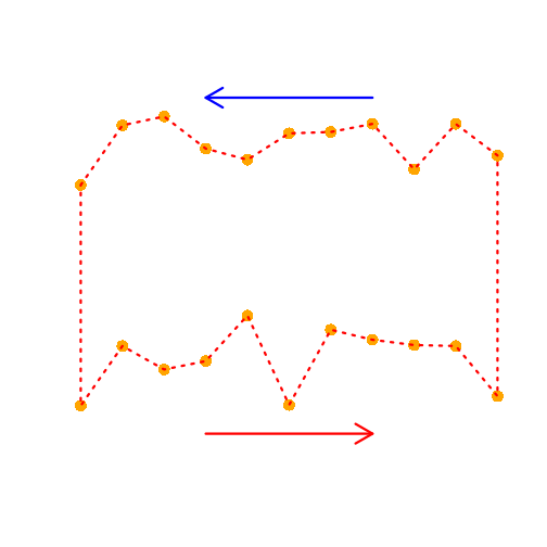
The top node points of the polygon correspond in our data to the upper quantile and the bottom points the lower quantile in respect to a probability. However the points to draw a polygon need to be given in sequence (like the arrows are showing in the picture). Since we have all data in the direction of increase in x, one of the vectors (top or lower) has to be reversed for both x and y coordinates.
Let’s set up the plot. In the first two lines I set the background to black and initiate a plot device. The type=”n” creates an empty plot but already dimensioned to the range of x and y. I set the axes to FALSE so the plot does not draw the axes now. I will draw in the end in white color as the background is black.
The following lines are the loop with the probabilities which, as said above, are half of the quantiles calculated. The px and py store the coordinates of the polygon nodes. The px is the unique count values in order (low quantile) and reverse (top quantile). The same happens with y but I need to pick the right row. So the low quantile is i (the ith row in the matrix) and the symmetrical upper quantile in the other end (length(q)+1-i). The color is given from the viridis gradient that we created above at the ith position.
par(bg="black")
plot(x, y, type="n", axes=FALSE)

for (i in 1:mx) {
    px <- c(counts, rev(counts))
    py <- c(mat[i,], rev(mat[length(q)+1-i,]))
    col <- colors[i]
    polygon(px, py, col=col, border=NA)
}
axis(1, col='white', col.axis="white")
axis(2, col='white', col.axis="white")
box(col='white')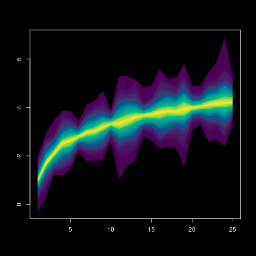
Differences to the animated plot
If you look at the details, there are some differences to the animated version of the plot that I made for the sake of simplicity in this code. First, the code does not really export an animation, it only takes time to render the full plot! I have done the animated version by exporting to a different image each polygon building up in the plot and sequentially merge them to a movie (outside R). Second, the animated plot has an alpha that becomes gradually opaque towards the median. However, I did not want to enter into many color representation details in this post. Third, the shaping function of y is based on a logistic function and not a simple logarithmic function as in this code. This avoided a longer formula in the code.
Well, it is all. Hope you liked it!