Applications of Phylin (Part 2 of 3)
The previous post started a series of 3 posts dedicated to the package that I have developed with my colleagues. After using 3 dimensional distance matrices, we will now move to connectivity using resistance distances with spatial climate layers.
Some background
In this example we will see how to include climate as a resistance layer to connectivity. Once we have that relation established we will proceed to the interpolation of lineages using phylin. Since we are using a climate layer, we can use results from climate models or reconstructions to assess the connectivity during other periods. In this example we will use current climate and future climate predictions (2061-2080).
I’m using the term connectivity as the resistance offered by the landscape/environment to the movement of some organism. The concept is identical to circuitscape that introduced the concept of isolation by resistance. Usually the resistance is optimized for our species of interest based on landscape features such as altitude, slope, land cover and other variables that might be important to explain space usage by the species. We will be using in this example a single layer of climate. The idea behind this example is a species that has a distribution constrained to lower values of temperature.
Check our article for a description of the R package. More details are also available in the vignette distributed with the package.
Advertisement
Needed packages
In this example we will be using two other packages along with the last version of phylin. We will need the package raster to open the climate layers in a spatial grid format and also the package gdistance that provide us the methods to calculate a resistance distance based on spatial data.
library(phylin)
library(raster)
library(gdistance)

set.seed(33)
I’ve also set the seed so you should get the same results as shown here.
We will need two different types of data for this example: the climate layers and species’ occurrence. For the first we will be using real data and for the second we will randomly generate with a few constraints.
Climate data
The climate data I’m using here comes from CHELSA climate. I’ve downloaded and processed the Annual Mean Temperature for the present and for the future (2061-2080 average). I chose a single climate model (CCSM4) and a single Representative Concentration Pathway (RCP85) which is the most severe greenhouse gas emission scenario. This largely simplifies this example as many models and RCPs are used to cover a range of possible scenarios.
The rasters are originally available at 30’’ spatial resolution but I have upscaled them to 1’ (~2km). I’ve also clipped both rasters to a smaller extent. This allows faster processing and a smaller file size for storing and downloading. You can find here the processed files for present and future.
Be sure to save files on the working directory for your R session and import them:
rst <- raster("AnnualMeanTemperature_CHELSA.tif")
rst.fut <- raster("AnnualMeanTemperature_CHELSA_CCSM4_rcp85_2061-2080.tif")
We will need a grid that defines the area for interpolation. It is usually a good idea to have an interpolation area with a smaller extent than the one used to calculate the resistance distances. It avoids edge effects on the calculations of the distance matrix, particularly if you have samples near the edge (for example, if you use a minimum convex polygon with the samples to define the study area).
In this example I’m eliminating a border of one pixel around the original raster:
grd <- crop(rst, extent(rst)-res(rst)[1] * 2)Advertisement
Species data
We will generate species data randomly. The idea here is to restrict the occurrence to low temperatures which are located in the elevated areas of the study region. We randomly sample 100 points from the raster where the temperature is less than 10°C. Than we use longitude to classify two lineages: lineage 1 on the west side and lineage 2 on the east.
sp.px <- sample(which(rst[] < 10), 100)
sp <- data.frame(coordinates(rst)[sp.px,], lin = 1)
sp$lin[sp$x > -1.3] <- 2
Let’s do a fast plot just to check the data:
plot(rst)
points(sp$x, sp$y, pch=sp$lin)
legend("topright", pch=1:2, legend=c("Lineage 1", "Lineage 2"))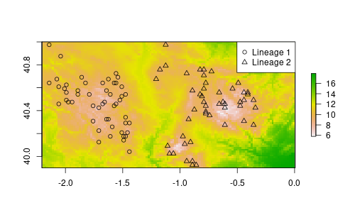
Resistance
Now we have to create a resistance layer from the climate layer. This step is often done using some optimization procedure, niche modeling or with some expert-based decisions. Here we simplify the process: we transform the original data with a logistic function setting the inflection point to 12°C.
conductance <- rst
conductance[] <- 1/(1+exp((rst[]-12)))
Although we speak about resistance, in gdistance conductance is preferred. Conductance is simply 1/resistance. The resulting raster has values of 1 (high conductance) for low temperature values and values towards 0 for higher temperatures. With increasing temperature, the conductance decreases, until we have zero conductance for high temperatures (to visualize the relation run plot(rst[], conductance[]))
To calculate a distance matrix using the conductance layer we have to run two extra steps that produce a transition matrix and some geocorrections if needed. I won’t enter into details about this code here (you can find a good explanation in gdistance vignette).
tr <- transition(conductance, mean, 8)
tr <- geoCorrection(tr, type="r")
Custom distance function
At this point we have what we need to calculate distances based on the climate resistance with gdistance. We still need to wrap the code in our own function with the mandatory arguments for phylin (see the previous post).
Within the function we will
- create a matrix with from coordinates above the to coordinates
- use commute distance (equivalent to the circuit theory) with both transition matrix and coordinates objects
- filter coordinates to return a matrix with from locations on rows and to locations on columns.
res.dist <- function (from, to, tr) {
	nf <- nrow(from)
	allcoords <- as.matrix(rbind(from, to))
	dist <- as.matrix(commuteDistance(tr, allcoords))
	my.dist <- dist[1:nf, (nf+1):ncol(dist)]
	return(my.dist/10000) # scaling down the distances
}
This is the same function as shown in the resistance vignette.
As you see, this function is slightly more complex than the one in the previous post because it needs three arguments. The coordinate matrices (‘from’ and ‘to’ arguments) that are mandatory to use in phylin plus a ‘tr’ that is the transition matrix needed for the calculation of the distances. As you will see below, we will have to pass this layer through the krig function when interpolating. This function also benefits simplicity in detriment of efficiency: it calculates many distances that are discarded in the last step. This will slow down the interpolation but it is still useful.
We can now use the function to calculate distances between samples:
r.dist <- res.dist(sp[,1:2], sp[,1:2], tr)Genetic distances
We simulated the occurrences and we don’t have genetic distances. So, let’s create a simple genetic distance matrix similarly to what we did in the previous post. We derive a matrix that is linearly related to the climate resistance distanced plus a error term. Also, to simplify the variogram, genetic distances greater than 4 units of resistance are kept constant. The log makes the variogram easier to fit in this case.
gen.dist <- r.dist
gen.dist[r.dist > 4] <- min(gen.dist[r.dist > 4])
gen.dist <- log1p(gen.dist + rnorm(length(r.dist), sd=0.1))
Variogram and interpolation
It is time to create a variogram with our data. We will need the genetic and resistance distance matrices.
gv <- gen.variogram(r.dist, gen.dist, lag=0.2)
gv <- gv.model(gv, range=5, sill=1.3)
plot(gv)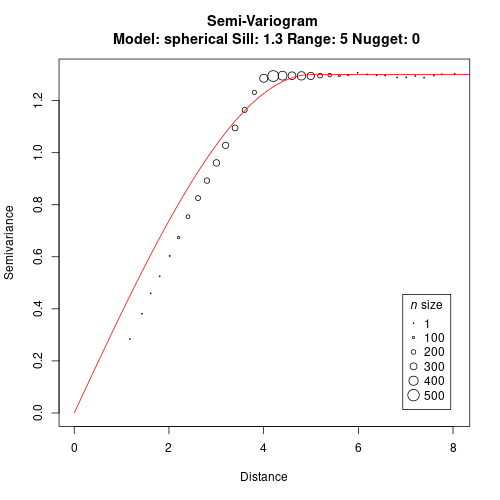
Now we can interpolate both lineages. I’m using the study area raster as a template to create another one (filled with zeros) that will be used to store the interpolation results. The loop interpolates both lineages and classify as presence pixels with prediction higher than 0.75. It stores 1 for first lineage and 2 for the second lineage.
lin.rst <- grd * 0

for (l in 1:2) {
  lin <- krig(sp$lin == l, sp[,1:2], coordinates(grd), gv,
              distFUN=res.dist, tr=tr, neg.weights=FALSE)

	lin.rst <- lin.rst + (lin$Z > 0.75) * l
}
An important detail in the code above is how we feed the transition matrix through the krig function. As said before, the distance function requires two mandatory arguments for source and target coordinates. However, our res.dist has a third argument that is the transition matrix. We have to convey this info through the krig by naming the argument. So, our distance function can have as many arguments as needed for the internal calculations but we have to be careful not to use same names as those arguments for krig function.
We can plot the raster with:
plot(lin.rst, col=c("white", "darkolivegreen1", "darkorange"),
     legend=F, asp=1)
legend(0, 41, legend=c("Lin.1", "Lin.2"),
       pch=15, col=c("darkolivegreen1", "darkorange"),
			 xpd=NA)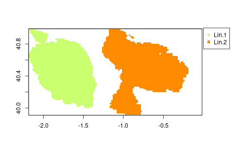
Future predictions
Now it is time to interpolate based on the future climate layer. For that we repeat the process using the same formula, creating a conductance for the future layer. We use this layer to build a transition matrix as well.
cond.fut <- rst.fut
cond.fut[] <- 1/(1+exp((rst.fut[]-12)))

tr.fut <- transition(cond.fut, mean, 8)
tr.fut <- geoCorrection(tr.fut, type="r")
Now we can proceed to the interpolation directly. Notice that I’m using the same variogram model we fitted before with current climate. We assume that this relation with space (i.e. resistance distances) is stable across periods. Otherwise we could not calculate a new model as we can’t possibly now if we can find the species in the future at the same locations we have observed in the present. We proceed with the interpolation repeating the same code as before, but using a new raster to store information and feeding the new transition matrix.
lin.fut.rst <- grd * 0

for (l in 1:2) {
  lin <- krig(sp$lin == l, sp[,1:2], coordinates(grd), gv,
              distFUN=res.dist, tr=tr.fut, neg.weights=FALSE)

	lin.fut.rst <- lin.fut.rst + (lin$Z > 0.75) * l
}
We can now plot the final results.
I’m just doing a simple trick to join both maps and keep track of the information. By multiplying future predictions by 10 we have 1 and 2 for each lineage only in the present, 10 and 20 for lineage presence only in the future, and 11 and 22 for lineages in both periods. This example is quite simple, so it allows to do that.
full <- lin.rst + lin.fut.rst*10
full[full==11] <- 3
full[full==22] <- 4
full[full==10] <- 5
full[full==20] <- 6

colors <- c("white", "darkolivegreen1", "darkorange",
            "darkolivegreen3", "darkorange3",
            "darkolivegreen4", "darkorange4")

leg <- c("Lineage 1 - Present", "Lineage 2 - Present",
         "Lineage 1 - Both", "Lineage 2 - Both",
         "Lineage 1 - Future", "Lineage 2 - Future")

plot(full, col=colors, asp=1, zlim=c(0,6), legend=FALSE)
legend(0, 41, legend=leg, pch=15, col=colors[-1], xpd=NA)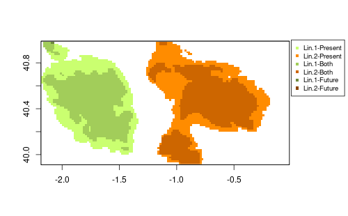
This last figure shows that climate might force contraction of the ranges. Both lineages are affected, but lineage 2 shows larger isolated patches that suggest a possible fragmentation of the distribution.
This is a extremely simplified example just to illustrate the possible application in the context of climate change. Real cases would require, for instance, more effort in optimizing the resistance distances, likely with more variables that would alone bring more complexity to the system. I hope to have opportunity to test this with real data soon but if you try it, let me know the issues and suggestions!