Applications of Phylin (Part 1 of 3)
Last September I was invited to make a post on the Molecular Ecology Spotlight. This was a small post to highlight some of the main features of the phylin R package I have developed with my colleagues. Instead of repeating what is already available in the documentation with the package (here, here, or here), I decided to describe a set of three possible applications of phylin that would show some of the potential of the method. In this series I will describe in more detail each of the examples shown there.
Some background
The distance between a location with a unknown value and the samples is used as predictor for the interpolated value. Typical spatial interpolation uses the Euclidean distance over a pair of coordinates. On the biological domain, this is equivalent to a isolation by distance model, where only the distance serves as driver of change. This was the method used in our first publication. However, we soon realized that other factors were important to derive the spatial occupancy of the lineages. The movement of species is not free but rather constrained by landscape features (altitude, habitat, etc) that offer resistance to migration. To include this in our model we decided to substantially change the method to incorporate an user defined distance metric. This opens a avenue for future applications. One possible use was described in our second article with distances considering the habitat resistance.
In this post I show a possible application to a 3 dimensional environment with the respective distance matrix. When I was programming this example, I was thinking about an animal in a aquatic environment that can move over the 3 dimensions without many obstacles. Of course, the system might be more complex and not limited to aquatic organisms. For instance, instead of depth, one can use altitude for a land species to get a better descriptor of the distance.
Advertisement
Needed packages
For this example, besides phylin we will also need package rgl to display the 3D plot.
library(phylin)
library(rgl)
Data
Now we need some data! We can randomly generate data in R following a normal distribution. We need a set of three coordinates locating the observation in the 3D space. We also need observations for two lineages.
n <- 25
lin1 <- data.frame(x=rnorm(n, 0.5, 0.5),
                   y=rnorm(n, 0.5, 0.5),
                   z=rnorm(n, 0.5, 0.5), lin=1)
lin2 <- data.frame(x=rnorm(n, -0.5, 0.5),
                   y=rnorm(n, -0.5, 0.5),
                   z=rnorm(n, -0.5, 0.5), lin=2)
lin <- rbind(lin1, lin2)
Now we have lineage 1 and 2 with distributions that are diagonally opposed in our 3D space: lineage 1 centered around (0.5, 0.5, 0.5) and lineage 2 around (-0.5, -0.5, -0.5).
Advertisement
User defined distance function
As default, phylin is using a Euclidean distance over a bidimensional surface. We need to code our distance function in a way that phylin accepts it. Within phylin, the distance function is used to calculate the distance from location to be predicted to each observation. The function ‘krig’ from phylin needs the distance function with two arguments: from and to. Both are matrices with as many columns as coordinates (in our case 3, one for each dimension). Distances should be only calculated from one set to the other. To compare, the function ‘dist’ from R base also calculates Euclidean distances but between all samples of coordinates of a single matrix. This would generate much information that phylin does not need. We should obtain the same results as ‘dist’ if from and to arguments in our function are referring to the same matrix.
Our ‘geo.3d.dist’ function bellow accepts both arguments and calculates the distance for each row of from to the other matrix. It provides the same row and column names following the row names in from and to matrices, respectively.
geo.3d.dist <- function(from, to) {
    # Calculate 3D Euclidean distances
    dst <- matrix(NA, nrow = nrow(from), ncol = nrow(to))
    dimnames(dst) <- list(rownames(from), rownames(to))
    for (i in 1:nrow(from)) {
        dst[i, ] <- sqrt((to[, 1] - from[i, 1])^2 +
                         (to[, 2] - from[i, 2])^2 +
                         (to[, 3] - from[i, 3])^2)
    }
    return(dst)
}
The first line inside the function creates an empty matrix dst with correct dimensions to be filled. It has from samples as rows and to samples as columns. Within the the for loop, I’m filling the matrix row by row, with 3D Euclidean distances to all to samples.
Interpolation grid
To interpolate we need a grid that sets the location where we want predictions to be generated. Usually this is a gridded map or a raster, where each pixel defines a location. Because we are using a 3D environment we will need to extend the typical grid to the vertical dimension. Lets start by creating a big cube of centroids:
grd <- expand.grid(x=seq(-1, 1, 0.1), y=seq(-1, 1, 0.1),
                   z=seq(-1, 1, 0.1))
To save some processing time, and for better visualization of the results in this example we will cut the cube by half. Our 3D grid is a vertically extruded triangle.
grd <- grd[grd[,1]<grd[,2],]Advertisement
Processing the data
The variogram needs two distance matrices relating samples: one based on the spatial distance between samples, and other based on some property of the samples that, in phylin is typically the genetic distance. For the spatial distance we can use the function we created before. As pointed out before, we can use the same matrix as from and to arguments to get a pairwise sample distance matrix.
geo.dist <- geo.3d.dist(lin[,1:3], lin[,1:3])However, we don’t have real samples in this example, thus we don’t have a genetic distance matrix relating the samples. We can generate it by adding the geographical distance to a random term. This way, the genetic distance are linearly related to the geographical distances. We will add a maximum genetic distance for samples that are more than 2 units apart geographically to avoid genetic dissimilarity to grow indefinitely with distance.
gen.dist <- geo.dist+rnorm(length(geo.dist))
gen.dist[geo.dist > 2] <- mean(gen.dist[geo.dist > 2])
Variogram modelling and interpolation
Now it is time to build our empirical variogram and fit a model. In the variogram we compare pairs of samples using the genetic and geographical distances.
gv <- gen.variogram(geo.dist, gen.dist)
plot(gv)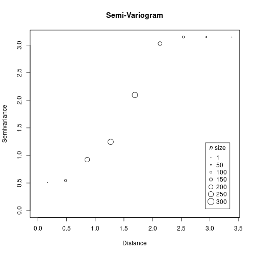
We can now fit a model to the variogram. We manually define range = 3 and sill = 3.2 for this model in this example (check the package vignettes for more examples on fitting the model to the variogram).
gv <- gv.model(gv, range=3, sill=3.2)
plot(gv)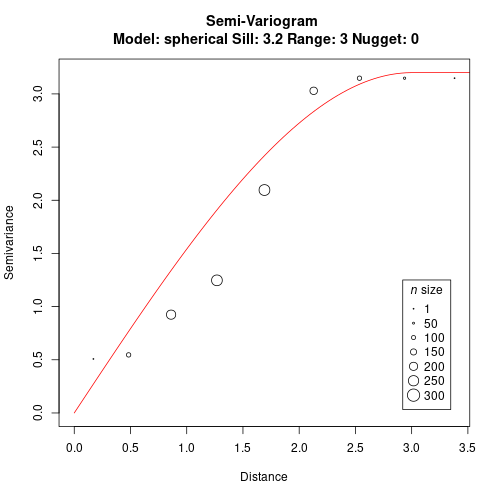
Lineage Interpolation
We are now ready to interpolate the probability of lineage occurrence using our simulated data and variogram model. As in the examples of phylin (available with the package in R), we will need to interpolate by setting the samples of the lineage of interest to 1 and all others to 0. In this example, we only have two lineages so the result of one is symmetrical to the other. We will interpolate lineage 1.
l1 <- krig(lin$lin == 1, lin[,1:3], grd, gv,
           distFUN = geo.3d.dist, neg.weights=FALSE)
The l1 object has the predictions for the probability of occurrence of lineage 1 at every location of the grid. Notice that using lin$lin == 1 we are giving a vector of 1s and 0s for each sample if it is classified as lineage 1 or not. Also notice that we are providing our distance function to the distFUN argument. Setting the neg.weights to false hampers the prediction to extend over the range [0,1].
At this point we have all we need to plot our example.
Plotting
We are using 3D data, so we can’t plot it easily with the base-R plotting functions. We will use the rgl package to provide a 3D plot of our results. Notice that the pixels in this scheme are 3D, commonly called voxels. We will need to set the colors for each based on the interpolation results. First we set our palette with 25 tones from the gradient Red - Yellow - Green.
pal <- hcl.colors(25, "RdYlGn")Now we can use the predictions to get the respective color. The probabilities range from 0 to 1, so we can multiply by 24 and add 1 to get the prediction in the range [1,25]. We can use it to extract the color.
col.l1 <- pal[as.integer(l1$Z*24)+1]Now it is time to finally plot. We will use the ‘shapelist3d’ function to plot all voxels. We are using the predictions as transparency (alpha) values. Low values will be more transparent and high values more opaque.
shapelist3d(cube3d(), grd[,1], grd[,2], grd[,3], size=0.05,
            color=col.l1, alpha=l1$Z)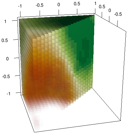
In your local version, the plot should be interactive and you might rotate and zoom to explore it.
By allowing the user to define a specific function, phylin can now be applied to more situations, as I try to show in this example.