Plotting 4 variables in a single plot
Visualizing the relation between two variables using a simple plot is a common task. When we have many variables, we often try to reduce dimensionality first, with a PCA for example, and then produce a plot depicting general patterns in the data. However, sometimes we just want to check how a variable relates to a few other variables without much analytical fuzz.
Setting the scene
A few months ago, I was analyzing some spatial data with global coverage which resulted in a raster variable. I wanted to do a fast check on how it varied with other global variables. I started by building some scatter plots, but I soon realized that it would not be so easy due to the influence of latitude and elevation. As an example, temperature can be higher in the tropics at lower elevations. Thus latitude and elevation are interacting with the temperature making a simple plot summary of the temperature quite difficult to achieve.
While experimenting several plots, I developed the idea of a more complex scatter plot with 3 variables and a fourth that would give the color or size of the points. I started with a scatter plot showing variables A vs. B and simultaneously C vs. B. Thus, the Y axis had the same variable (B). The problem of very different ranges on variables A and C (bottom and top axes, respectively) is solved by scaling each variable to the range 0 to 1 and then add tick marks with correct values. The result was very difficult to read, as for each row in the data, there are two points in the plot, one corresponding to coordinate pair (A,B) and other to (C,B). Even if we add color based on the fourth variable, it would still be nearly impossible to see anything in the plot, especially in the case of a huge number of data points. So I needed to apply a summary function per plot area, that allows to display, for instance, average values. The way I solve this is to divide the plot area in small squares, extract the points within each square and calculate the average of the fourth variable for A vs.B and for C vs. B. The average value is plotted in the square divided into two triangles, one for each pair of variables: the A vs. is the lower triangle and the C vs. B is the top triangle.
Advertisement
Packages and data
I have developed a small plotting function that does exactly that. To make easier to distribute it I have created the package assortedViz. Packaging has the advantage to associate the code with some help and examples. In the future, I’ll add other plotting functions to the package but for now it only includes one. I’m not uploading it to CRAN so you need to download and install it manually. The ‘readme’ file has some instructions on how to install it. We will be also using raster package.
library(raster)
library(assortedViz)
The data I’ll use next for the example is based on freely available spatial data but requires some processing that I won’t detail much. I’m using Annual Mean Temperature (Bio1) and Annual Precipitation (Bio12) from the CHELSA climate database. I have also downloaded elevation data from the GMTED2010 and maps of species richness from the IUCN spatial archive. Because of the different extents and resolution, I cropped the rasters to the same extent (-180, 180, -90, 80) with 0.075’ spatial resolution (about 8Km). I’m not making the resulting rasters available so you have to process it on your own to follow the example.
We stack the fully aligned rasters and extract the values to a data frame where we also reserve two columns for coordinates (we will need the latitude later).
stk <- stack("bio1.tif", "bio12.tif", "spRich.tif", "elev.tif")
df <- na.exclude(as.data.frame(stk, xy=TRUE))
Plotting the variables
We can now do a first plot of the data with the triplot function. The basic call is triplot(x1, x2, y, z, size), where x1 and x2 are the bottom and top variables respectively, y the left side variable and z the variable being summarized and displayed with different colors in the triangles. The size parameter refers to the side of the square dividing the plot area. Since x1, x2 and y are scaled to the range 0-1 before plotting, the plot area is always square. The size parameter is also given in the range 0-1. So with the value 0.04, the plot area is divided in 25x25 squares.
triplot(df$bio1, df$bio12, df$y, df$spRich, size=0.04)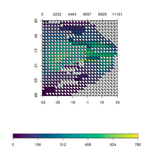
The plot is still quite difficult to read and will see next how to improve it. But you can already see the idea behind it: values of richness within each square are extracted and the average is calculated. Note that this is done twice per square, one for temperature vs. latitude and another for precipitation vs. latitude. Average values of richness are plotted with different colors in the respective triangle. The plot might give the idea that only the points intersecting the triangle are being summarized, but it is the square that defines the sampling area. By inspecting the plot, we see that highest richness values are around equatorial regions and are associated with higher values of precipitation and temperature.
One thing we could do to improve the plot is to remove square borders when there is no data to display and force the border to be white. This makes the plot a bit lighter and easier to read.
triplot(df$bio1, df$bio12, df$y, df$spRich, size=0.04,
  displayNA=F, border="white")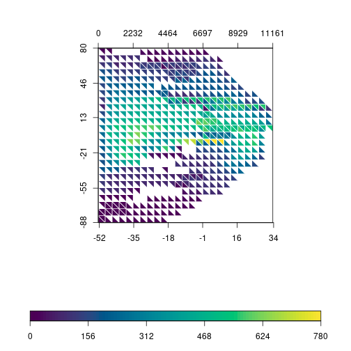
The function allows to customize the color scale and we can use any gradient function (rainbow, heat.colors, terrain.colors, etc). Instead of using the built-in gradients, I’m using R base functions to generate a custom color gradient:
grad <- c("lightblue1", "aquamarine3", "darkolivegreen3",
          "gold", "red")
rich.colors <- colorRampPalette(grad)

triplot(df$bio1, df$bio12, df$y, df$spRich, size=0.04,
  col.FUN=rich.colors, displayNA=F, border="white")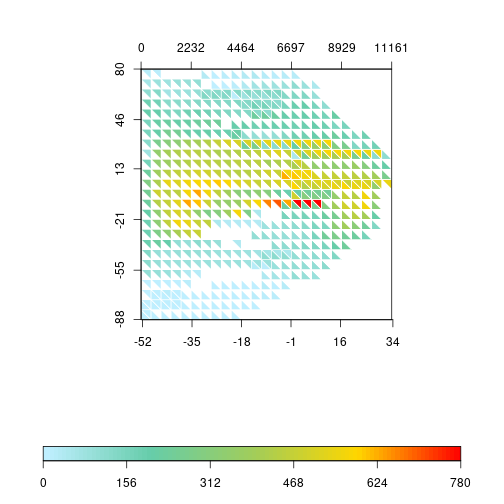
Precipitation data has a tricky distribution to plot, with many near 0 values and low number of pixels with very high precipitation. We can try to spread out those values by log-transforming the variable. Let’s rapidly check the effect of the transformation with an histogram:
layout(matrix(1:2, 1))
hist(df$bio12)
hist(log1p(df$bio12))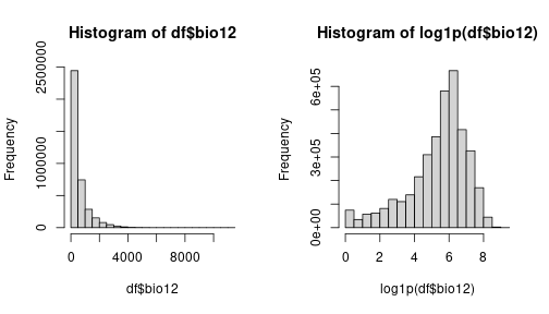
Comparing the original distribution on the left with the log-transformed variable on the right, we see that the transformation spreads the values as we intended. So, let’s go on with the transformation in our triplot.
triplot(df$bio1, log1p(df$bio12), df$y, df$spRich, size=0.04,
  col.FUN=rich.colors, displayNA=F, border="white")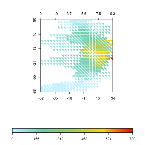
The pattern of the triplot changes substantially. It has a kind of “boomerang” shape, with higher precipitation and temperature between tropics and decreasing values towards the poles. The highest values of species richness are concentrated near the equator. The distribution of species richness values is also very skewed towards low values. Most squares have average values lower than 300 (the global average is around 75 species). Thus, let’s try to apply the same log transformation to species richness.
layout(matrix(1:2, 1))
hist(df$spRich)
hist(log1p(df$spRich))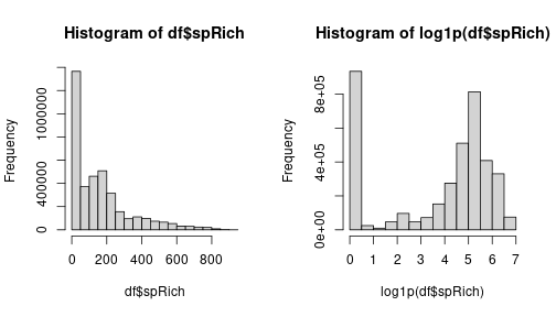
We still have a lot of zeros but the other values are more spread out. This will use more colors of the gradient and might improve the general aspect of the plot. So let’s apply it to the triplot.
triplot(df$bio1, log1p(df$bio12), df$y, log1p(df$spRich),
  size=0.04, col.FUN=rich.colors, displayNA=F, border="white")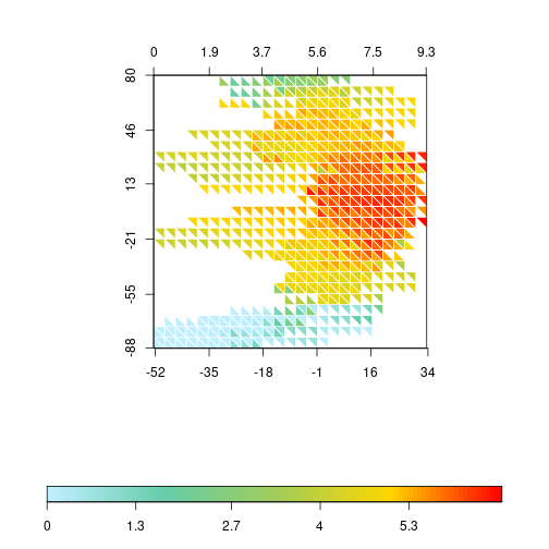
Of course, we could do the same by changing the color gradient directly. R allows a bias in the gradient function that creates a similar trend by compacting the color transitions at the lower values.
rich.colors2 <- colorRampPalette(grad, bias = 6)
triplot(df$bio1, log1p(df$bio12), df$y, df$spRich, size=0.04,
  col.FUN=rich.colors2, displayNA=F, border="white")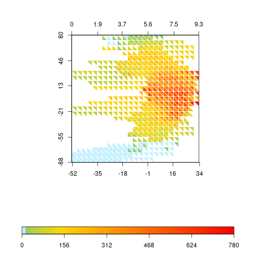
Advertisement
I still prefer the less abrupt change of colors in the lower values of the transformed richness, so I’ll keep that one (it also serves better to illustrate later how to change the label values).
We are almost finishing this example. The latitudinal pattern is interesting, but I would also like to check what happens when we use the elevation gradient. To do so, we can replace the Y variable in the plot.
triplot(df$bio1, log1p(df$bio12), df$elev, log1p(df$spRich),
  size=0.04, col.FUN=rich.colors, displayNA=F, border="white")
At the center of the plot it is possible to see that, at elevations between 1500 and 3000m, the increase of the annual mean temperature has a faster effect on allowing higher richness than the log of precipitation. Also, at lower elevations (<1500m), richness is generally high, independently of precipitation, but temperature does have a stronger effect on richness, limiting the richness at lower values.
The log transformation of precipitation and richness produces a more appealing plot but the values on labels should be on the original range and not on the transformed ones. The triplot function allows to adjust that. Let’s create some sequence of values that we want to display on labels. For temperature and elevation we use a sequence with a step of 10°C and 1000m, respectively. For precipitation and richness the step is not constant, so we choose values on a near exponential scale. Note that we only need to set ‘at’ values for temperature and elevation, but, for temperature and richness, we need to provide ‘at’ with log values and corresponding untransformed values for ‘labels’.
x1 <- seq(-50, 30, 10)
x2 <- c(0, 3, 15, 50, 200, 700, 2500, 10000)
y <- seq(0, 7900, 1000)
z <- c(0, 2, 6, 20, 50, 150, 400, 911)
triplot(df$bio1, log1p(df$bio12), df$elev, log1p(df$spRich),
  size=0.04, col.FUN=rich.colors, displayNA=F, border="white",
  x1.at=x1, x2.at=log1p(x2), x2.lab=x2, y.at=y,
  scale.at=log1p(z), scale.lab=z)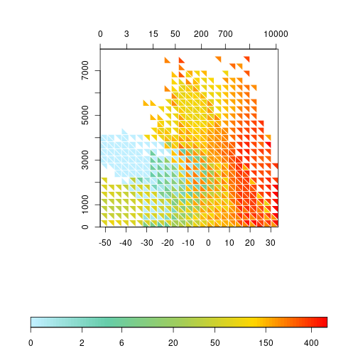
The plots produced until now summarize the values within the sampling square with the average. The triplot function has a FUN parameter that accepts another function producing one value from a vector of values. For instance, if we are interested in the dispersion rather than the average, we can plug in the sd function replacing of the default mean.
triplot(df$bio1, log1p(df$bio12), df$elev, df$spRich,
  size=0.04, FUN=sd, col.FUN=rich.colors, displayNA=F,
  border="white", x1.at=x1, x2.at=log1p(x2), x2.lab=x2,
  y.at=y)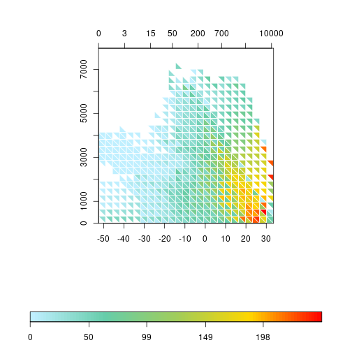
Advertisement
Conclusion
I believe this covers most of triplot functionality. I had the idea of this plot when exploring some spatial variables as in this example, but it is not limited to it. In fact, if you check the simple examples in the function’s help page, it uses the iris data. The function is not particularly fast when computing the data for each triangle, which can be a little bit annoying. The smaller the size argument, longer the processing time…
If you have any suggestions, ideas or want to contribute, please open an issue in the github page or contact me directly.

